Letter Project Reflection
 |
| Brainstorm ideas |
 |
| Thumbnail sketches |
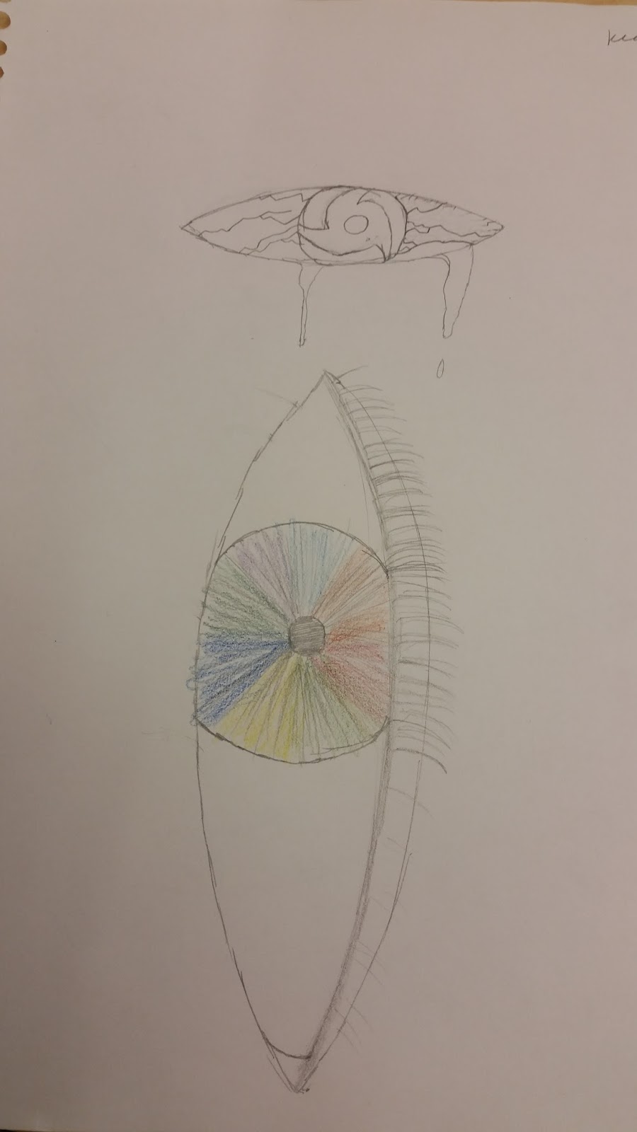
- The above pictures show my brainstorm ideas as well as the thumbnail sketches that I came up with. I found the process helpful because after sitting down and taking the time to think about what to do for my letter, I came up with various ideas (some more creative than others). I was partial to the "I island" idea, as well as the "Eye I". Eventually I settled on the "I island" idea since I personally felt that the "Eye I" would be too simple and I wasn't sure what to add to it. Also, drawing proper/realistic eyes is hard.
 |
| "I Island" |
 |
| "Eye I" |
- As I said before, I felt that the "Eye I" would have too much blank space and would not work out so well. And again, eyes are just tedious to draw. In order to give it an island feel, I wanted to add a palm tree, and a shovel (and with Ms. Lee's advice, a pirate ship). Originally, the items that would make up the letter were going to be black bars like those on treasure maps (Ha, "I" marks the spot. Get it?), but I settled on logs instead.
- The most challenging aspect of this project was getting the angle and sizing of the "I" to be proper. As seen in the final below, the angle is decent enough, however I do realize that I messed up the two logs at the bottom and as a result, the overall letter looks more like a Z than an I. Angling and size was not a major issue with the draft, but since I needed to have a once inch border around the image, it was somewhat harder and I accidentally messed up on the sizing.
 |
| Final Draft |
- Am I satisfied with my project? I'd have to say, overall that I am pleased with the outcome to an extent. I personally did I think a good job with the art (albeit it looking cartoony, and Ms. Lee having to give me advice for a lot of it). However as stated above, I would change the size of the bottom two logs to be smaller in order to make the letter look even more like an I compared to a Z. Also, (as Ms. Lee was so kind to point out), I could make various areas of the composition darker than they currently are (Ex. The palm tree). But all in all, I'm pleased with the outcome.


No comments:
Post a Comment